
Updating the face of Reagan
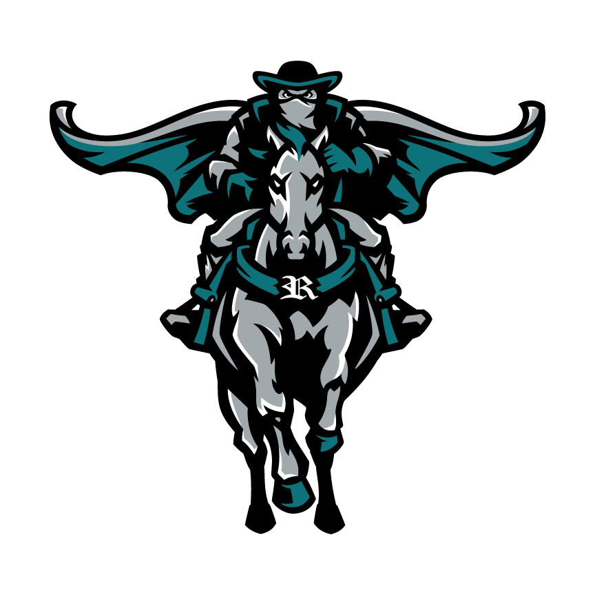
Pictured above is the new Reagan logo. This replaced the original logo from the school’s opening in 2005.
December 21, 2017
There have been many improvements to Reagan’s campus this year. New art now fills the 100 hallway, and the signature Reagan “R” lights up the bricks at the front of the school with a teal glow.
But a more recognizable aspect of Reagan is undergoing a change. This summer, faculty and administrators discussed replacing the official school logo.
The school’s original logo pictured the Raider mascot riding a white horse and holding a sword pointed up into the air. From afar, the sword looks as if it is part of the horse, giving it what some say is a “unicorn” look. The logo has been used since the opening of Reagan in 2005.
The logo has been replaced with a Raider pictured front-view riding a gray horse. The Reagan “R” is centered on the breast collar of the horse. The biggest change to this logo is the added cape flowing in the background.
“The logo is very intimidating,” said junior Omni McCollum. “I like the horse and the colors on the Raider.”
The updated face of Reagan didn’t come as a total surprise. This year logo specifically for athletics was developed comprised of a simple teal flag with the “R” in the middle, reminiscent of the NFL Tampa Bay Buccaneers’ logo. Both the athletic and official logo feature the official shade of teal that was established last year–Pantone 322.
Change is hard to get used to, but some upperclassmen were happy to see the old logo go.
“I am glad the old one is gone because it looked like a dolphin and did not scream Raider,” said junior Robert Sprinkle. “This one is dark, intimating, and overall reflects a Raider.”
The new logo was created with the help of the business VIP Branding. It is sister companies with BSN Sports and Varsity Sports, who have done business with Reagan before.
The logo did not start from scratch. Twitter polls let students vote on different trademarked athletic logos from club or professional sports to determine what students looked for in the Raider.
“We have been working on this logo for the last year,” principal Brad Royal said. “Polls have been online through social media, and the students voted to change the old logo.”
One logo on the poll was that of the Texas Tech Red Raiders logo, which had an overwhelming amount of support.
“The students voted, and we ran with it,” Royal said. “I held coaches meetings to vote on the new logo. I even went to different English classes throughout the day to get students’ approval, and about 95 percent loved it.”
Within just a few weeks of the logo being announced, the wrestling team has already put the Raider on the back of their sweatshirts.
“Our wrestling team loves the new logo,” said head wrestling coach Josh Cutshaw. “We decided to get our team warm-ups this year and wanted something new. I think the new logo fits well into what Reagan represents. It’s eloquent and graceful, but intimidating and hard-nosed at the same time.”
The Raider can also be found on the official Reagan High School website. However, not everyone is fond of change.
“Although the new logo looks intimidating, many people don’t like change and whatever we see we won’t immediately like,” McCollum said.
Other students focused on the details in the Raider that they were not particularly favored.
“I think I would have liked it more if they separated the gray colors,” said senior Maggie Mabe. “It would have made it easier to distinctly see the main focus.”
Whether you like change or not the Raider is here to say. But the good news is the “unicorn” will stick around too.
“The old logo will never go away,” Royal said. “It is a part of Reagan’s history, but I love the new logo. We worked on it for over a year and I think it is a great addition to our school.”